Collections
Collections are any list of repeating items. You can visually create a collection from any individual component by selecting the Create collection button in the top right corner of the UI component editor. All collections are generated as code with real-time subscriptions automatically set up.
Data binding
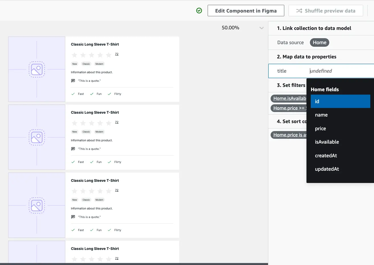
Amplify Studio offers a visual way to bind collections to items in your data model. Collection items can be filtered, sorted, or linked to specific records from the content management view.
GraphQL and DataStore
Amplify Studio supports data binding to all Amplify GraphQL APIs, with or without DataStore. Learn more about DataStore and Conflict Resolution here.
For APIs without DataStore, there are some minor Collection feature limitations:
- Collections cannot be Sorted
- Collections have limited Search
- Collections have limited Pagination
Additionally, if your data has any relationships, APIs without DataStore require a query depth of 4 or greater. To update your codegen query depth:
- Navigate to the root directory of your project in your terminal
- Run
amplify configure codegen - When prompted, set query depth to 4 or greater. All other options can be set to your preference
- Run
amplify codegento generate queries with your new depth
Tutorial
- Launch Amplify Studio for an app
- Create a collection from a component
- Link collection to a data model
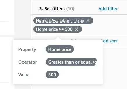
- Set filters to customize what data should be displayed
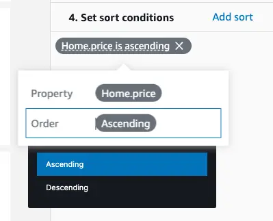
- Set sort conditions to customize how the data should be displayed
Note: If your component doesn't have a property backed by a data model, then you need to manually map a component's property to a designated data model field.
Set filters
Filters control what records are displayed in a collection. You can add multiple filters to a single collection.
Set sort conditions
Sort conditions control the direction records are displayed in a collection.
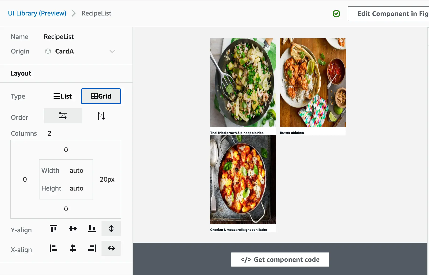
Edit layout
You can edit some of the Amplify UI collection properties directly in Studio. Changes to the layout properties (e.g. List vs. grid, direction, order, padding) are reflected in the real-time preview.
Set Search and Pagination
Search
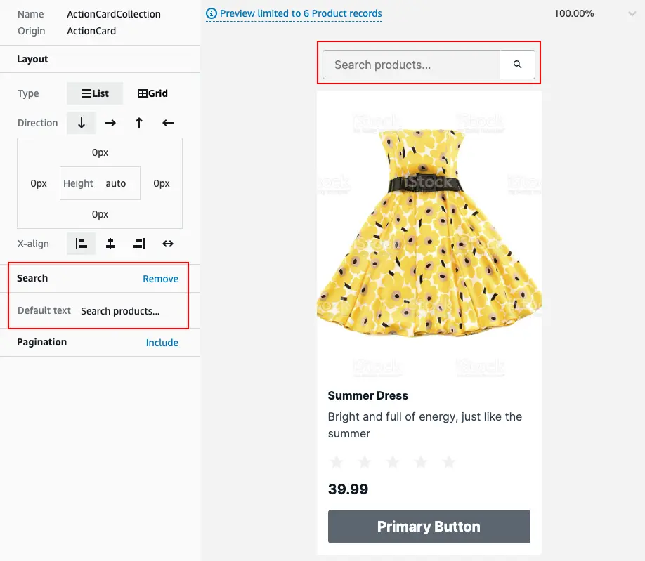
Collections can be configured to automatically include a search bar by selecting the Include link on the left-hand bar. You can customize the placeholder for the search bar, and test it in-browser.
Pagination
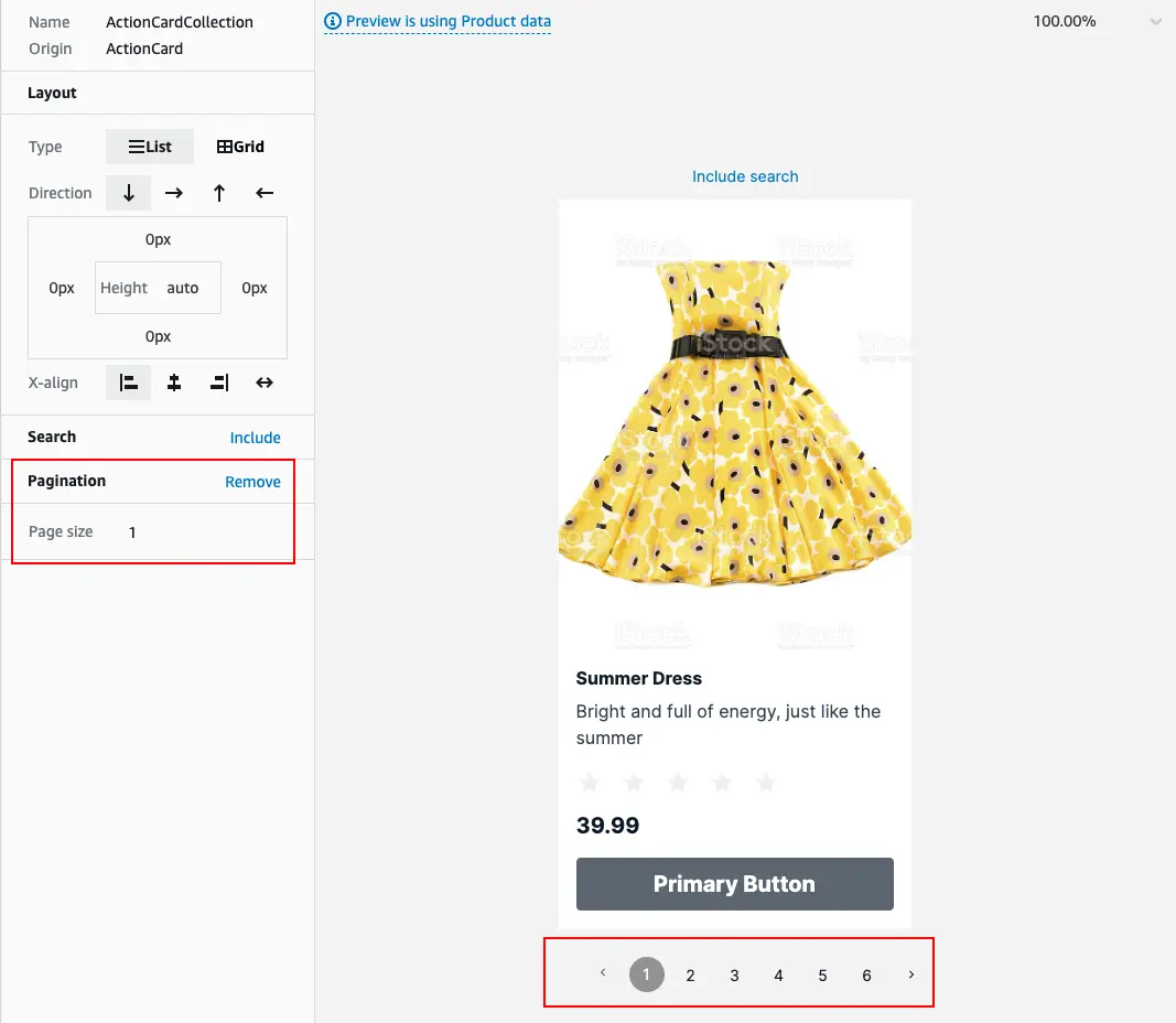
Collections can be configured to automatically paginate, with a specific number of items per page. Select Include on the left-hand bar to enable pagination and set the number of items.
For collections bound to GraphQL APIs without DataStore, pagination has limited support. Users can step forward through pages (e.g. page 1 to page 2), but cannot skip pages (e.g. page 1 to page 3).
