Customize form inputs
Use the Form Builder in Amplify Studio to customize React form components. You can add new form inputs, bind them to a field, customize labels, and add validation rules.
To access Form Builder, login into Amplify Studio.
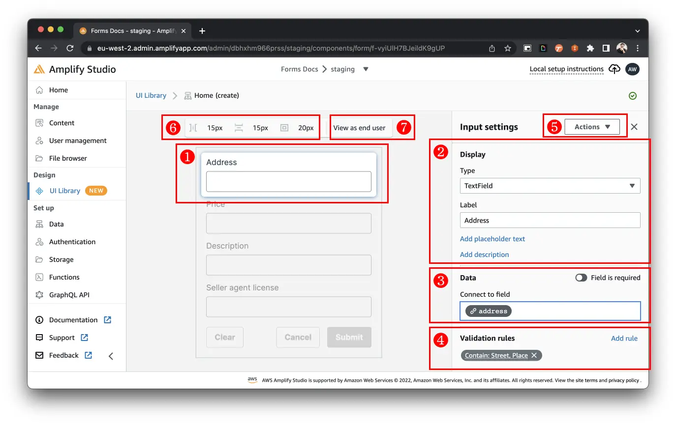
The Form Builder interface consists of the following items:
- Form input: Select a form input to reveal the Display, Data, and Validation rules settings.
- Display options: Configure the input type, label, placeholder, and description.
- Data: Connect the input to a field in the submission payload.
- Validation rules: Visually add validation rules. Learn more about How to add validation rules.
- Action menu: Action menu to delete a form input.
- Form spacing editor: Set form padding, and horizontal and vertical gaps between inputs.
- View as end user: Test the form inline, without needing to integrate the form into a React app.
Add a form input
Add form inputs to personalize the form to your use case. To add a form element:
- Move your mouse onto the center form canvas.
- Hover in between, before, or after a form input until a blue bar with a (+) sign appears.
- Click the blue bar with the (+) sign.
- Select the form input you want to add.
Every input element in your form can be customized. Select a field in the form to open the configuration menu, where you can customize parts of the input, like its display label and placeholder.
Some form inputs have unique configurations, like File Uploader. Learn more about configuring special fields in the documentation.
Reorder form inputs with drag and drop
Rearrange form inputs vertically or horizontally.
- Click and drag a form input
- Move form input above, below, left, or right of another form input
- Drop when a blue bar appears, indicating the form input's new placement
View form as end user
If you want to quickly test your form customizations, select View as end user to view the customized form fully functioning within Studio.
Note: If your form is connected to a data model, then form data will be saved to the cloud upon clicking Submit. If this app is being used in production, the data you are saving may be visible to customers.
Configure form spacings (paddings and gaps)
Add spacing to your form and between inputs. The spacing editor allows you to set the following spacing values (from left-to-right):
- Horizontal gap: the space between horizontally arranged inputs.
- Vertical gap: the space between vertically arranged inputs.
- Padding: the space around the form inputs and the form's border.
Spacing values can either be a CSS length value (px, rem, em, %) or a reference to your theme object's spacing value (xss, medium, large).
Configure options for Select, Radio Group, or Autocomplete Field
Select Fields, Radio Group Fields, and Autocomplete Fields require a set of options for your users to choose from. For example, a "Status" input can only have the options "Not started", "In progress", and "Done".
- Pick a Select Field, Radio Group Field, or Autocomplete Field input
- Go to Data > Options
- Enter available options line-by-line or paste in a JSON array, such as
["Not started", "In progress", "Done"]
Enable list inputs
TextInputs can accept multiple values by toggling "Accept multiple values", enabling users to add, update, and remove items. This functionality is only enabled for inputs not linked to a data model. If your input is linked to an existing model, this feature is controlled directly on the model by toggling the "Is array" property on the corresponding field.
- Select a form input that's not connected to a data model
- Go to Data
- Select Accept multiple values
Here is what a list input looks like for the end user:
Add sectional elements
Use sectional elements to divide your form up into multiple parts. This is useful to represent nested data and their designated form inputs in individual sections.
- Move your mouse onto the center form canvas.
- Hover in between, before, or after a form input until a blue bar with a (+) sign appears.
- Click the blue bar with the (+) sign.
- Scroll to the bottom of the element search list
- Select Heading, Divider, or Text
Delete a form input
- Selecting the form input.
- Select Action > Delete.

