Theming
Use AWS Amplify UI Builder plugin to customize the UI primitives in your Figma file to match your brand's look and feel. Amplify Studio allows you to visually configure the Amplify UI theme definition.
The plugin saves your theme directly in the Figma file itself so when you sync your Studio app with Figma it will automatically bring in the updated theme as well.
Install AWS Amplify UI Builder (Figma plugin)
To install the UI Builder plugin:
- Go to the UI Builder plugin page
- Click "Install" on the top-right corner
- Go to your Figma file
- Right-click an empty area of the canvas and select Plugins > AWS Amplify UI Builder or use the Figma quick actions menu by pressing
command/control + /then typing "AWS Amplify"
Colors
1. Modify brand colors
Select your own brand color or choose a preset. Your brand color affects almost every single UI primitive and allows you to quickly modify your components look and feel to match your brand.
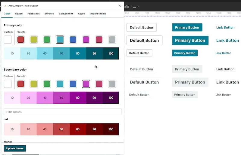
Amplify Theme Editor will automatically cascade color levels 10 - 100. You can modify the auto-generated levels further by selecting the level and tweaking the HEX or HSL values to your exact specification.
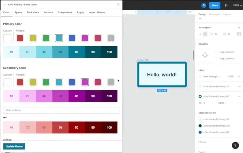
2. Use brand colors in Figma
Every color listed in the Amplify Theme Editor is also available as a Figma color style.
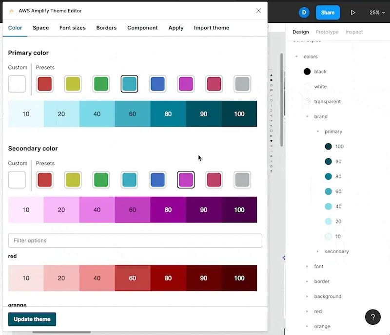
You can choose any layer and assign the fill to your brand colors. Updating the brand colors in the plugin will update the color styles.
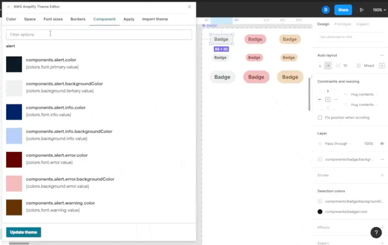
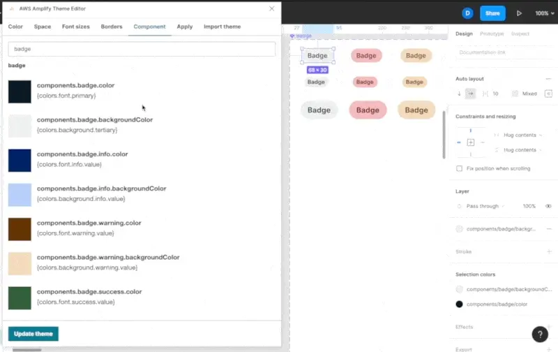
3. Modify UI primitive colors
Individual primitives such as Alerts have their own bindings for color to fine-tune their look and feel as well. This is especially useful as you start defining colors for states such as "success", "warning", "error", or "info".
To change colors of UI primitives:
- Open the Amplify Theme Editor
- Click on the "Component" tab
- Select the value you want to edit. For example:
components.badge.error.backgroundColor. You can also filter the list of component tokens with the search bar at the top - Choose a new color
- Click "Update theme"
Colors in the theme can either be references to other colors or exact Hex, HSL, or RGB values.
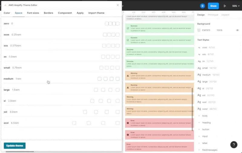
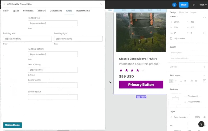
Space
Each Amplify UI theme contains definitions for spacing such as "small", "large", or "xl". You can define the spacing scale within the "Space" tab in the Amplify Theme Editor.
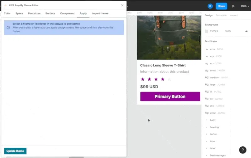
To apply spacing tokens to your own components:
- Open the Amplify Theme Editor
- Click on the "Apply" tab
- Select a frame
- Configure it as a reference by entering
{space.<SPACING_TOKEN>}. For example:{space.small} - Click "Update theme"
Font sizes
To update the font sizes in the theme:
- Open the Amplify Theme Editor
- Click on the "Font sizes" tab
- Click on any of the font sizes to edit it
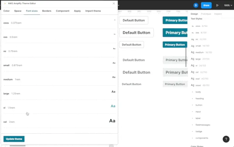
You can input 'rem' values or 'px' values. Updating font sizes will update the primitives, text styles, as well as any Figma layers that use that font size.
Borders
You can edit border widths and radii in addition to colors as well.
To update the font sizes in the theme:
- Open the Amplify Theme Editor
- Click on the "Borders" tab
- Click on any of the border widths or radii to edit it
You can apply these border values to your own components by selecting the 'Apply' tab and selecting a frame component. Subsequent changes to the core border widths and radii will update any usage in your Figma document.
Breakpoints
The Amplify Theme Editor allows you to apply breakpoints to your component variants, making them responsive. To change the pixel values for your breakpoints:
- Open the Amplify Theme Editor
- Select the Breakpoints tab
- Select any breakpoint size
- Enter your preferred pixel value for that breakpoint
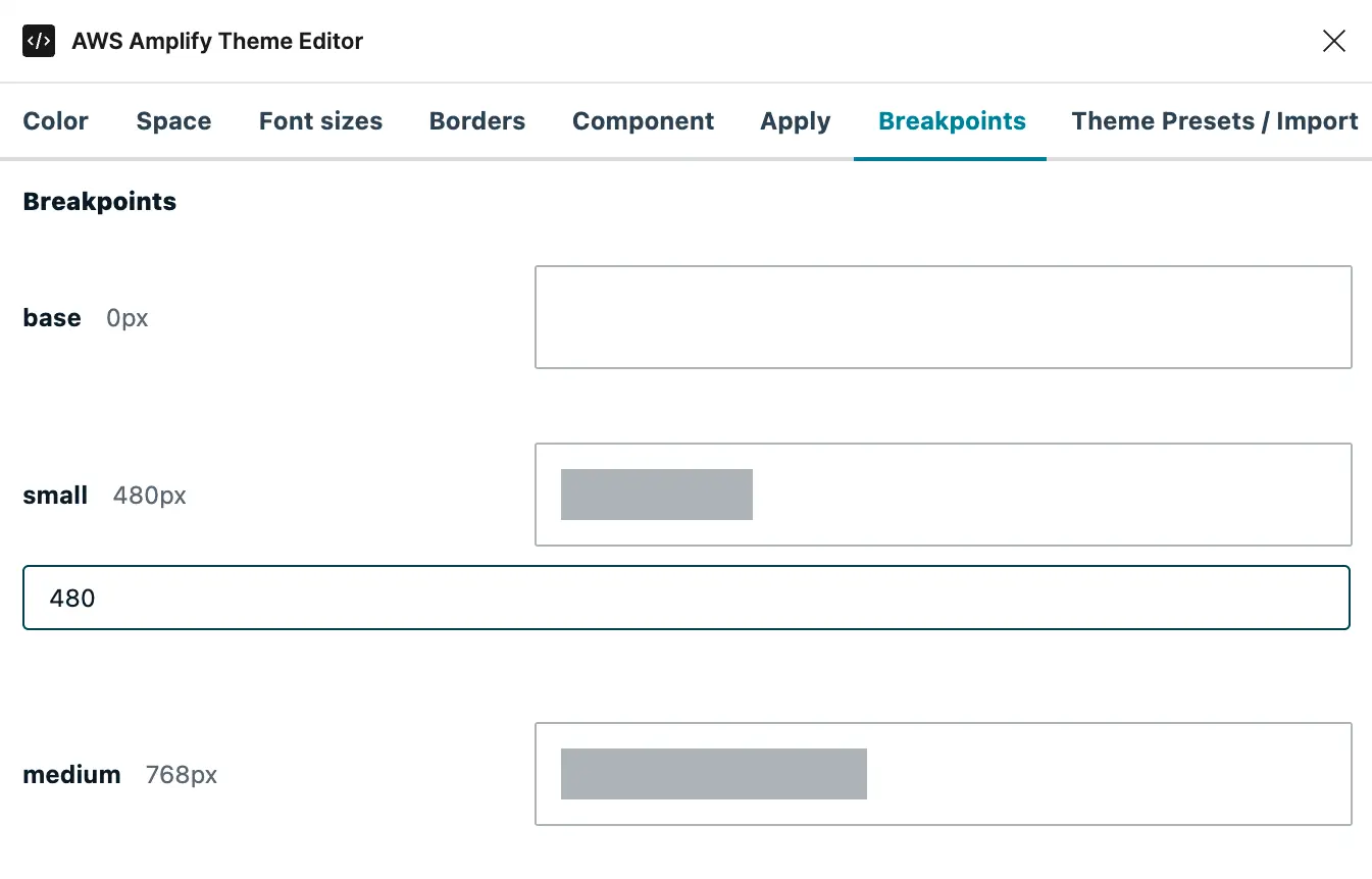
The grey bar within the outlined box will indicate your pixel value compared to a standard 1920px-wide display.
You can learn more about how to use breakpoints in the Responsive components documentation.