Responsive components
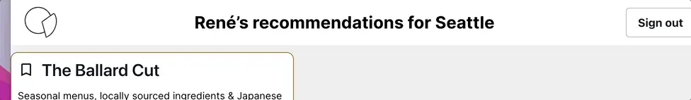
You can use Amplify Studio to dynamically toggle between different component variants based on your app's breakpoint. For example, you can have the navigation bar shrink to a smaller size as the window gets smaller.
1. Set your preferred breakpoints in Figma
To apply breakpoints to components generated by Amplify Studio, you must have a Figma account with the AWS Amplify Theme Editor plugin installed.
By default, all Amplify UI provides the following breakpoints as part of the Amplify UI theme:
{ base: '0', small: '480px', medium: '768px', large: '992px', xl: '1280px', xxl: '1536px',}Breakpoints are set at the Amplify UI Theme level, which means they apply to all components in your Figma file. You can customize these breakpoints using the Amplify Theme Editor plugin:
-
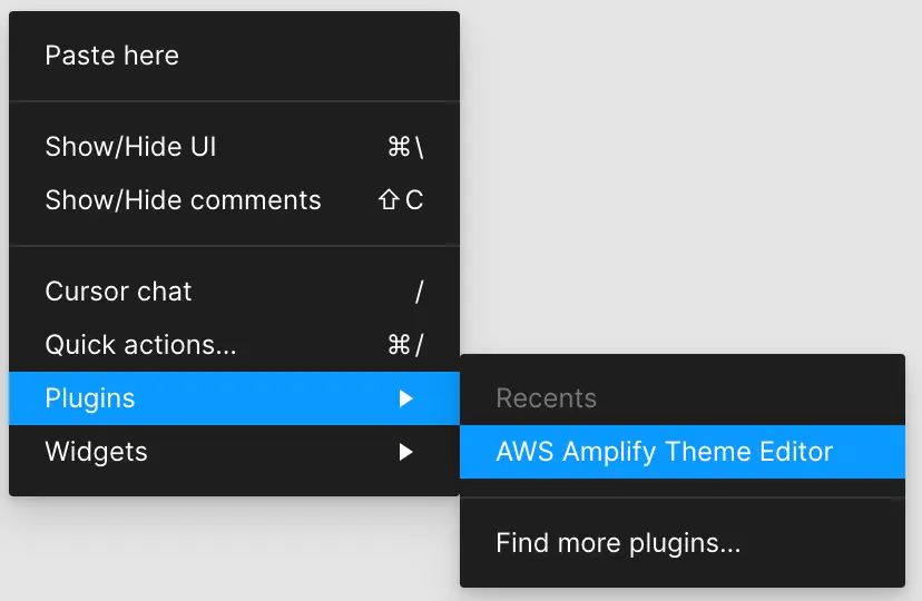
Right click in your Figma project and select Plugins > AWS Amplify Theme Editor
-
Select the Breakpoints tab and click on any breakpoint to customize the pixel value
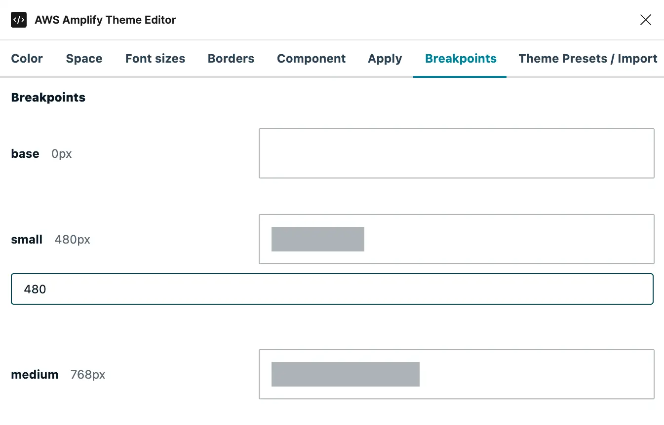
The grey bar within the outlined box will indicate your pixel value compared to a 1920px-wide display.
2. Configure your Figma variants
To make a component responsive, create different variants for the component based on the breakpoints. Learn more about creating variants in Figma's documentation.
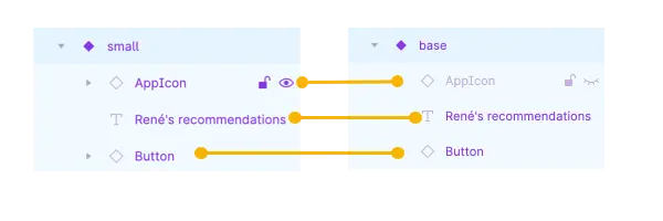
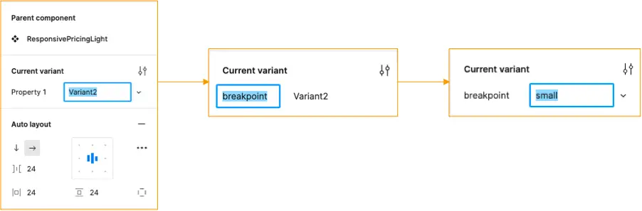
When generating a component with variants in Figma, a Property will be created and assigned to each variant. Make the following configurations to your component:
- Change the component property name to
breakpoint - For each variant, set
breakpoint's value to one of the supported values (e.g.small,xl, etc)
3. Render and test your component
With your design complete in Figma, import and render your component using Amplify Studio UI Builder:
- Sync your Figma file with UI Builder
- In your local project, run
amplify pull - Import and render your new React component in code
- Resize the window - your component will change automatically based on the breakpoints you set before
Note: rendering responsive components requires the Amplify CLI version 3.1.1 or higher. To check your CLI version, run
amplify -vand to upgrade, runamplify upgrade
Advanced: Configure responsive components with existing variants
Figma allows users to create variants based on multiple properties. For example, a component may need breakpoint variants (small, medium, and large) and displayMode variants (light mode, dark mode).
If your component has any variant properties in addition to breakpoint, additional steps are required for responsiveness. All additional properties must be given inline values, or the component will not be responsive.
In the below examples, the ResponsiveToolbar component has both breakpoint and displayMode variants. In the following example, the component will not automatically be responsive.
function App() { return ( <div> <ResponsiveToolbar /> </div> );}export default App;To make this component responsive, displaymode must be given a value. In the following example, the component will now automatically be responsive.
function App() { return ( <div> <ResponsiveToolbar displaymode='light' /> </div> );}export default App;Alternatively, multidimensional variants can be separated into separate components, each with only the breakpoint variant property. For example, the above component could be split into ResponsiveToolbarLight and ResponsiveToolbarDark, and rendered conditionally. In the following example, the component will now automatically be responsive.
function App() { let darkMode = false return ( <div> {!darkMode ? <ResponsiveToolbarLight/> : <ResponsiveToolbarDark/>} </div> );}export default App;