Figma-to-Code
Amplify Studio offers an integration with Figma, allowing you to generate clean React code by importing your Figma design file. Figma is a browser-based UI and UX design application that is used to build high-fidelity designs. In the standard product development lifecycle, UI or UX designers build mockups that get implemented as code by developers. Amplify Studio automatically converts any Figma component in your Figma file to a React component that is then usable in your app.
Step 1: Set up Figma file
To get started, all you have to do is link your Amplify Studio project to a Figma file. While you can link any Figma file to Studio, for the best end to end experience, we recommend starting with our Figma file. To get started from scratch, duplicate our Figma UI file.
This file contains the following pages:
- README: The README page explains how to use the Figma file to create new components, theme primitives, and customize layout and styling.
- Theme: The theme page displays the theme values and design tokens Amplify UI uses to style the primitives. If you want to theme the primitives, use the AWS Amplify UI Builder Figma plugin to make changes to the theme. Any changes you make on the theme page itself won't be generated in code.
- Primitives: Primitives are building-block components such as alerts, buttons, and badges. These primitives correspond to the Amplify UI primitives and get exported to code with all the primitive properties. This page is read-only. Changes to the primitives on this page will not be reflected in code that is generated.
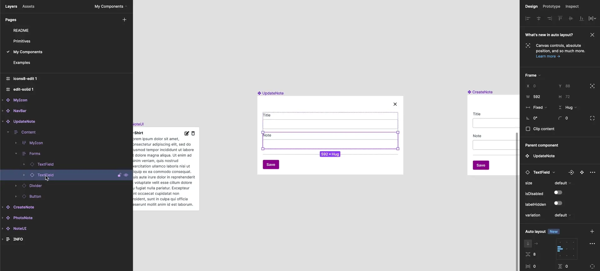
- My components: This page contains all of the custom components built using the primitives. Amplify provides dozens of components such as news feed, social media, and marketing hero components to get you started. Customize these to match your needs or build your own components.
- Examples: This is for demonstration purposes only, to show designers how to use our components to build entire pages.
Please follow the README in our Figma file to learn how to create your components to optimize for code quality.
Step 2: Link Figma file in Studio
In Amplify Studio, enter the URL for the Figma file you just created (or duplicated). You will be asked to authenticate with Figma.
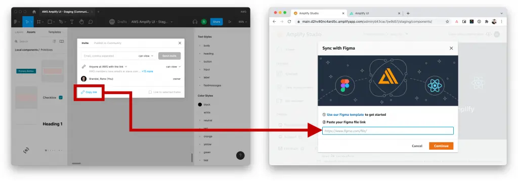
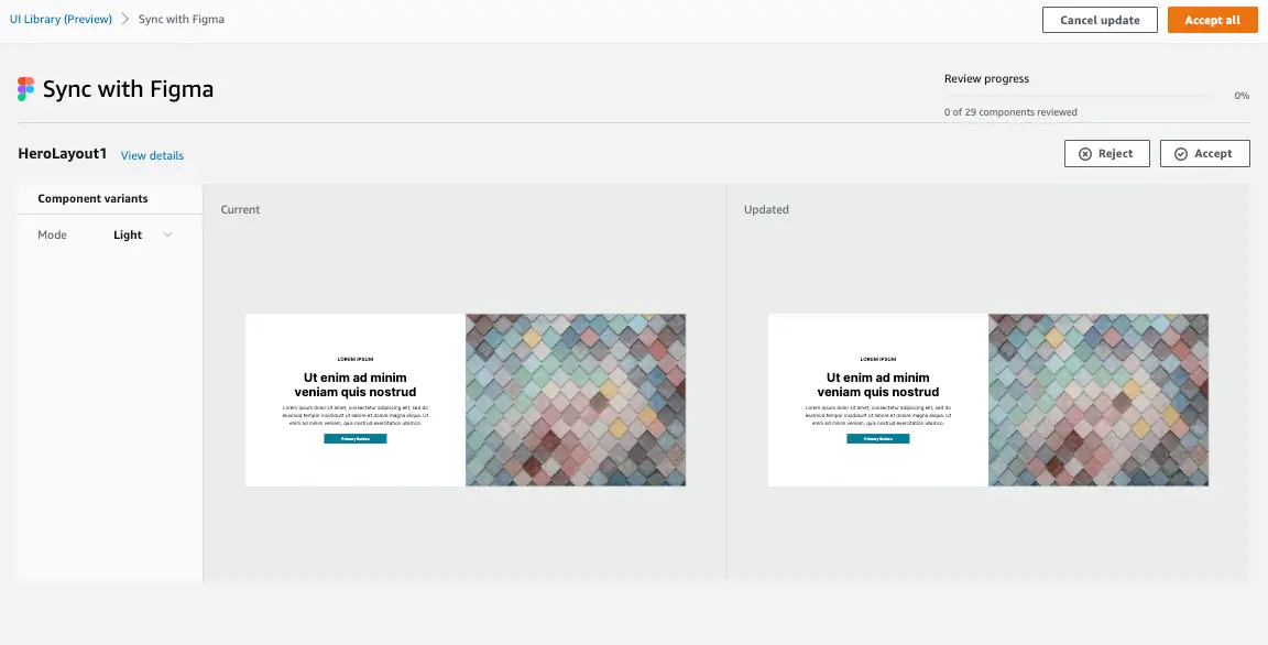
After authenticating with Figma, you will see a list of components that you can sync. Choose Accept all to import all components, or walkthrough them one-by-one to make sure they are visually acceptable. Once you complete the sync, you should see a list of components that have been imported. All previews of the components are live renders of the actual coded components. Open your dev tools inspector to check it out!
Step 3: Configure your project
Before importing and using your components and theme, the project will need an initial setup. To get started, create a new React App then,
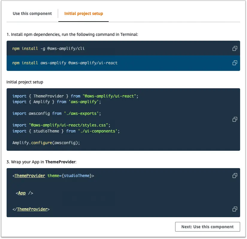
- Navigate to your application root directory and install the following npm dependencies
npm install -g @aws-amplify/clinpm install aws-amplify @aws-amplify/ui-react- In your application's entrypoint file (e.g.
src/index.jsfor create-react-app orsrc/main.jsxfor Vite), add the following imports and configuration
import {ThemeProvider} from "@aws-amplify/ui-react";import { Amplify } from 'aws-amplify';import amplifyconfig from './amplifyconfiguration.json';import "@aws-amplify/ui-react/styles.css";import studioTheme from './ui-components/studioTheme';
Amplify.configure(amplifyconfig);- In your application's entrypoint file (e.g.
src/index.jsfor create-react-app orsrc/main.jsxfor Vite), wrap the<App />with the following:
<ThemeProvider theme={studioTheme}> <App /></ThemeProvider>Alternatively, initial project setup instructions can be found at any time within any component. In Studio, pick a component and choose Configure to get to the component editor screen. Choose Get component code at the bottom of the page.
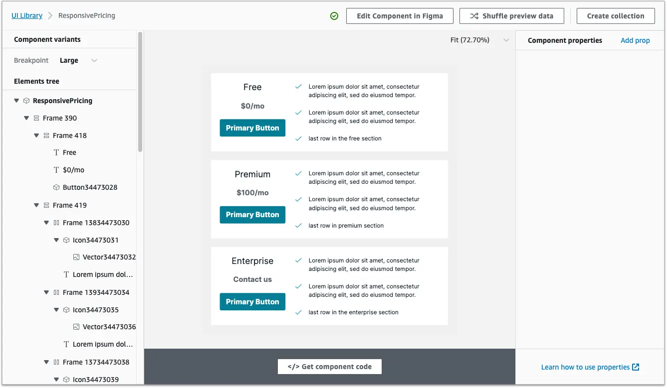
Go to the Initial project setup tab and follow the setup instructions.
Step 4: Import and render your components
Navigate to the root directory of your project. In the project root directory, run amplify pull to import React code generated from your Figma components. Then, import your components to use them in your application. Replace "ComponentA" and "ComponentB" with the names of your components:
import { ComponentA, ComponentB } from './ui-components';Amplify CLI places all generated UI component code in the src/ui-components directory as JSX and TS files. All generated code is built with primitives from the Amplify UI library.
Although you can inspect the component code, any changes to component code will be overwritten on the next amplify pull. Instead, you can update the source component in Figma and resync, or you can use overrides to customize individual components inline. Learn how to extend your components with code here.
Upgrading Figma files
In order to upgrade your Figma file, the newest version of all Amplify UI primitives must be imported into your customized Figma file.
- In you current Figma file, open the AWS Amplify UI Builder Figma plugin and click the Copy Theme button in the bottom.
- Duplicate the new Figma community file into your Figma account.
- In the new Figma file, open the AWS Amplify UI Builder Figma plugin. Navigate to the Theme presets/Import tab. Click in the paste your theme input and paste (ctrl/cmd + v). This should update the new file with your theme.
- In the new Figma file, go to the My Components page and delete everything
- Go back to your old Figma file and copy everything from the My Components page.
- In the new Figma file on the My Components page paste your components
- Open the AWS Amplify Figma Plugin, you should see a message at the top. Click the button to update the components. This will re-link the instances of Amplify UI primitives in your file.
- Get the URL of the new Figma file and replace the URL of the Figma file in Amplify Studio.
- Click the Sync from Figma button.
Figma file changelog
1.3.0: June 21 2023
This update coincides with a major change to the Figma plugin which now allows for generating Amplify UI React code inside Figma!
Added a Theme page to display Amplify UI theme values and documentation. Updated the default custom components and examples to show more real-world use-cases. Improved the documentation and organization of the file. Added primitives Loader and Placeholder, and Button variations warning and destructive.
1.2.0: July 25 2022
- Update supported Amplify UI React version to 3.1.0.
- Add TextAreaField primitive component. You can change any existing TextField into a TextAreaField by selecting the desired TextField instance and choosing "TextAreaField" under the Swap Instance dropdown.
1.0.0: March 2 2022
- Fixing primitive component layer names to map properly to React props.
- Removing the Icon primitive and adding a custom Icon component. This change allows for easier icon customization.
- Fixing visual discrepancies between Figma file and React components.
- Re-organizing primitive component variants to make the default variant more expected. For example, default size and default variation of the button instead of the primary variation.
- Adding version number to the Figma file
Limitations
Components created with UI Builder are currently not compatible with React Server Components, including the Next.js App Router.