UI event handler
Amplify Studio offers the ability to bind UI component events (onClick, onChange, and more) to actions to build interactive components. Use the UI component editor to map UI components' events to actions for navigation, data manipulation, authentication, and more. All data bindings get automatically included in generated code.
- Launch Amplify Studio for an app
- Select an UI element such as a button
- Click
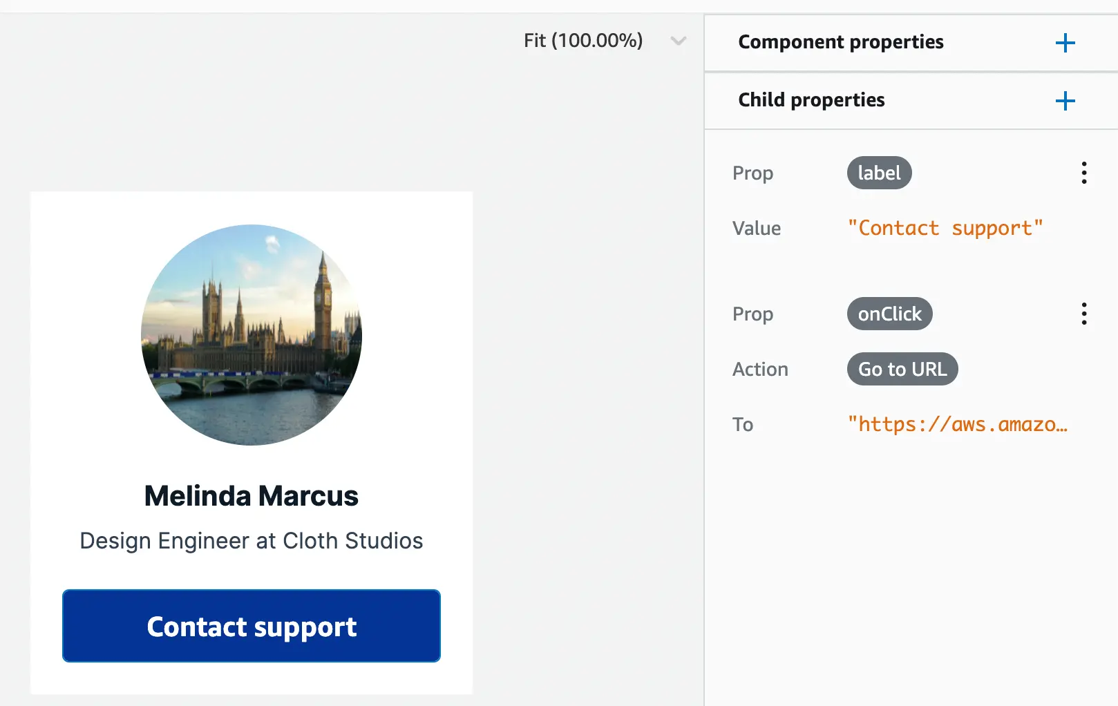
Set onClick actionon Child properties panel - Select an action to bind it to the UI element
Bind UI to navigation actions
You can bind UI elements to navigation actions. Navigation actions include the ability to go to a URL, open a URL in a new tab, scroll to an anchor, and refresh the page.
Go to URL
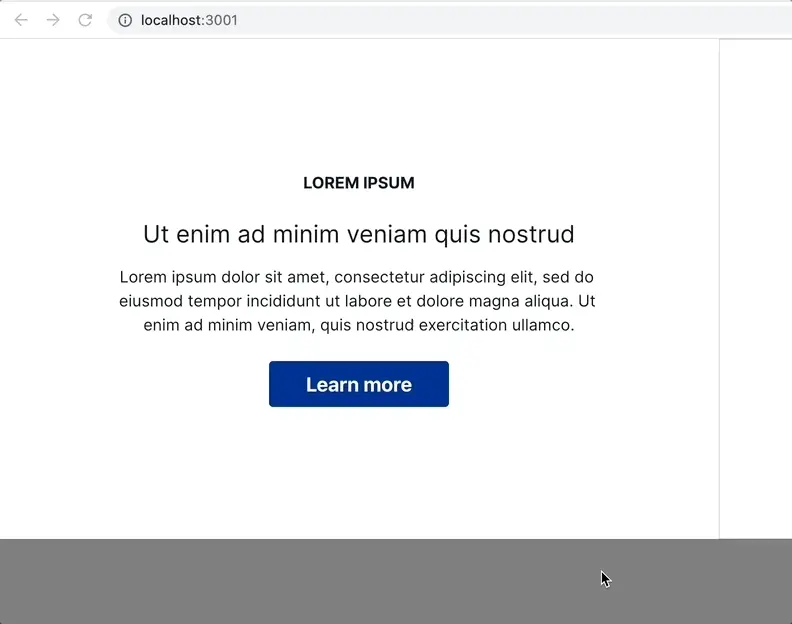
The "Go to URL" action navigates the customer to the designated URL. You can also construct the URL with dynamic data provided by the component's top-level properties.
- Select the
Go to URL - Enter the target URL. For example:
https://support.example.com
| Studio interface to "Go to URL" | Live app navigating to the URL |
|---|---|
 |  |
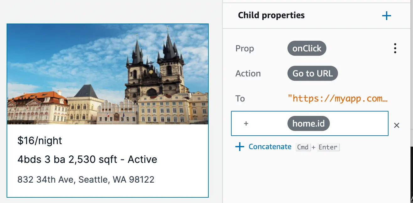
- Dynamically navigate to a specific item's URL in a collection by concatenating the item's id. In the example below, the URL is concatenated with
home'sidfield.
Open URL in new tab
Select "Open URL in new tab" to open the target URL in a new tab. Similar to Go to URL, you can also construct the URL with dynamic data provided by the component's top-level properties.
Scroll to anchor
You can bind an onClick action to scroll to a designated anchor (based on HTML's id attribute) on the page. For example, have a table of contents section that then navigates to a specific element in a UI.
- Select the
Scroll to anchor - Enter
lorem-ipsumas the value - In your app code add an HTML element with
id="lorem-ipsum"
|
|
Refresh page
Select "Refresh" to execute a browser refresh of the current page.
Bind UI to create, update, or delete a data record
You can bind UI elements to data actions, so your Figma-generated UI components function as forms. Data actions include the ability to create, update, and delete records from your database.
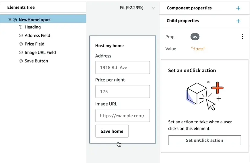
Make sure to mark the component as a form for accessibility.
- Select the top element from the element tree
- Add a new child property named
as - Set the value to
form
This will render the component within an HTML <form /> element.
Using DataStore
Forms created using Studio event handlers can work with any Amplify GraphQL API, with or without DataStore.
If you are using DataStore, however, DataStore will only use the default authentication type and not the additional types unless configured with MULTI_AUTH enabled. In most cases, you will want to have authentication for your forms. For example, an app might use API Key for public content and Cognito User Pool for personalized content once the user logs in.
To enable multiple authentication types in DataStore & Amplify Forms, please refer to Configure Multiple Authorization Types.
Create a record in database
You can create a new record based on the values provided by input fields. For example, you have a form to create a new "Home" for a rental listing site. The form contains inputs for the address, price, and an image URL.
|
|
Render the component with the "Create" data action. Pro tip: Amplify Studio's collection components synchronizes data in real-time. If a new record is available in the database, it will automatically sync to the app.
import { NewHomeInput, HomeCollection } from './ui-components'
...<div>  <NewHomeInput />  <HomeCollection /></div>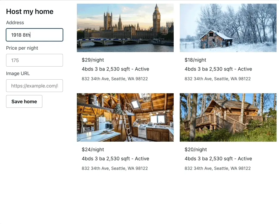
Update a record from database
You can update an existing record using the "Update" data action. For example, users can click on a home in a collection and update its values with a form.
|
|
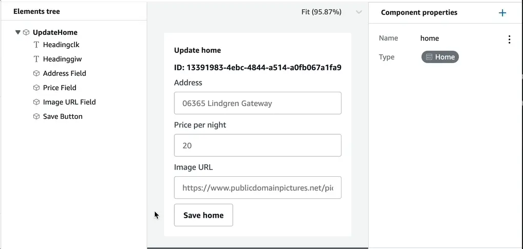
Use the overrideItems property in collections to configure an onClick handler to select a home to update. Optionally, configure the form's placeholder values to be the current home value.
Pro tip: Amplify Studio's collection components synchronizes data in real-time. If a record is updated in the database, it will automatically sync to the app.
import { UpdateHome, HomeCollection } from './ui-components'import { useState } from 'react'
...
function App() {  const [updateHome, setUpdateHome] = useState()  return (    <div>      <UpdateHome home={updateHome}/>      <HomeCollection overrideItems={({ item }) => ({        onClick: () => setUpdateHome(item)      })} />    </div>  )}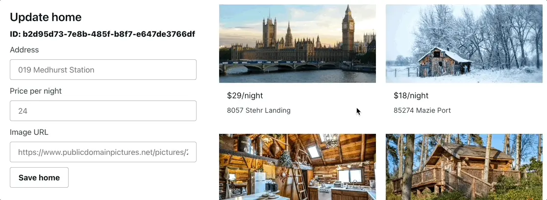
Delete a record from database
You can delete a new record based on a model's ID field. For example, if you have a modal to delete a "Home" from a rental listing site.
|
|
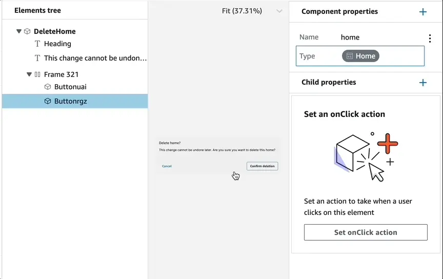
In your app code, you can set an onClick handler for Home collections to show the delete modal. Then, set the DeleteHome component's home property to configure which home to delete. You can also listen in to the ui Hub events to dismiss the modal after the record is deleted.
import { HomeCollection, DeleteHome } from './ui-components'import { Hub } from 'aws-amplify/utils'import { useState, useEffect } from 'react'
...
function App() {  const [showDeleteHome, setShowDeleteHome] = useState()  useEffect(() => {    Hub.listen('ui', ({ payload }) => {      if (payload.event === 'actions:datastore:delete:finished') {        setShowDeleteHome()      }    })  }, [setShowDeleteHome])
  return (    <div className="App">      <HomeCollection overrideItems={({ item }) => ({        onClick: () => setShowDeleteHome(item)      })} />      {showDeleteHome &&        <div className='modal'>          <DeleteHome home={showDeleteHome} />        </div>}    </div>  );}
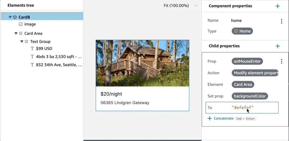
Bind UI event to modify another UI element
Use the element modification action binding to introduce more UI-level interactivity for your components. For example, you can configure hover effects, trigger color changes when a user clicks on an element, or toggle visibility on other elements based on user interactions. To add a hover effect to an element:
- Set the "onMouseEnter" property
- Select "Modify element property"
- Select the component you want to modify
- Select the "backgroundColor" as an example
- Update the desired background color value
- Repeat with "onMouseLeave" property to reset the background value
Bind UI to "sign out" actions
Use the "Sign out" actions to sign out the user from the app. Choose to either sign out from the current device or across all devices, also known as global sign out.
|
|
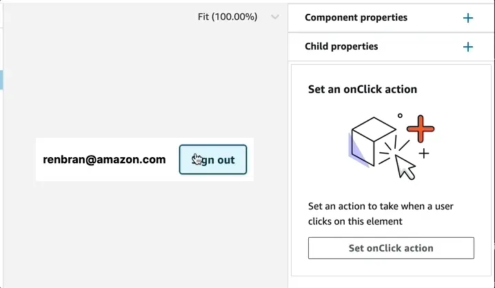
The sign out actions work in combination with the Authenticator component. When you sign out, the Authenticator will appear to request the user to sign-in again.
import { withAuthenticator } from '@aws-amplify/ui-react'import { UserInfo } from './ui-components'
function App() {  return <UserInfo />}
export default withAuthenticator(App);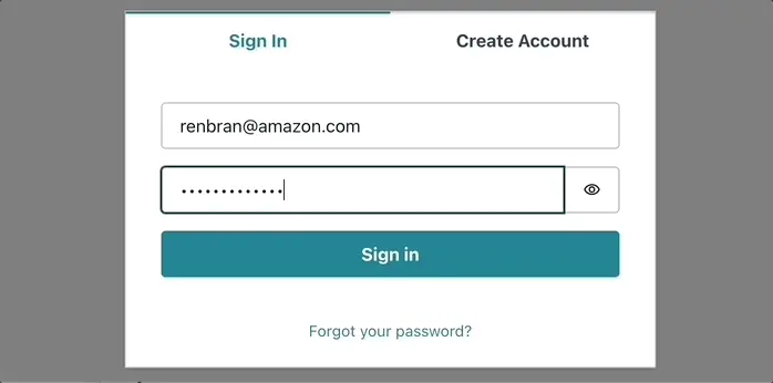
Handle UI changes after action execution
In case you want to add additional business logic after an action is executed, review Add additional business logic before or after action execution. You can use this capability to dismiss a modal after a data record was created, send analytics event after action, or display loading indicators when a record is being created.