Extend with code
When you run amplify pull, Amplify automatically generates JSX and TS versions of your Figma components. You cannot directly edit the code for these components as they will get overwritten on the next pull, but you have exposed mechanisms to extend the code.
Extend generated code
Extend generated code via component prop
When using Figma created components, you can use any exposed component props. The example code below shows how you can add pagination to a collection. The isPaginated prop is a property of the <Collection/> component. Similarly, you can use any prop such as gap or isSearchable to extend the collection.
1import {AmpligramCollection} from './ui-components'2
3<AmpligramCollection isPaginated itemsPerPage={3}/>
Extend generated components via overrides prop
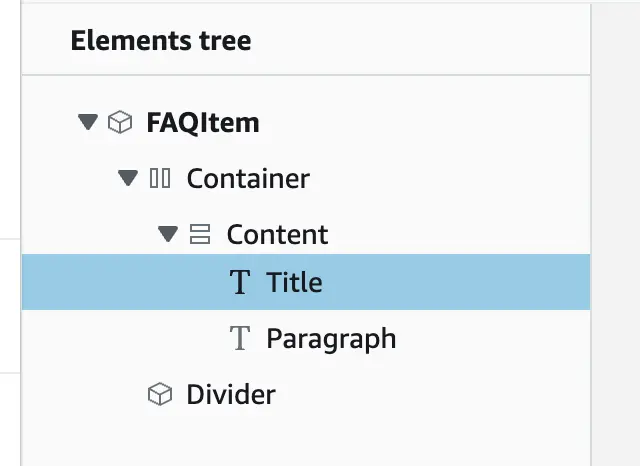
All generated code exposes an overrides prop on all components and children to give you full control over extending generated code. The following example shows how to override the color of the title of the FAQItem component, that is part of the default Figma file, to red.
- In Studio, navigate to the
FAQItemcomponent - Find the name of the text element, in this case
Title - Wherever you are rendering the
FAQItemadd anoverridesprop.
1import {FAQItem} from './ui-components'2... ... //⬇️ Element name3shown in Studio4<FAQItem overrides={{ Title: { color: 'red' } }} />Extend generated collections via overrideItems prop
All generated Collection code exposes an overrideItems prop to give you full control to extend each collection item with context its data item. overrideItems expects a function that accepts an { item, index } parameter and returns the override props that should be applied to each collection item.
The following example shows how to override each collection item to show a different color based on their index in the collection and alerts the user of which the clicked home.
1<HomeCollection2 overrideItems={({ item, index }) => ({3 backgroundColor: index % 2 === 0 ? 'white' : 'lightgray',4 onClick: () =>5 alert(`Home with id: ${item.id} and ${item.address} clicked!`)6 })}7/>
If you want to override a prop for a specific element within a collection item, pass an override object to overrideItems.
1<HomeCollection2 overrideItems={(item, index) => ({3 overrides: { Share: { fontWeight: 'bold' } }4 })}5/>Nesting collections
Component slots within collections allow you to conditionally render additional nested collections. For example, use nested collections to generate a collection of posts, each with its own collection of related comments.
In this example, you have two collections: AmpligramCollection, which has a slot named comments, and CommentViewCollection. These are bound to the Post and Comment data models, which have a one-to-many relationship - therefore, each record in the Post data model has a field named Comments, whose value is an array of Comment records.
First, nest the CommentViewCollection within the comment component slot in the AmpligramCollection by using the overrideItems functionality. This will render every item in the CommentViewCollection in each Ampligram slot.
1import { AmpligramCollection, CommentViewCollection } from './ui-components';2
3function App() {4  return (5    <AmpligramCollection6      overrideItems={({ item, index }) => ({7        comments: <CommentViewCollection /> //Add the child collection to the "comments" slot8      })}9    />10  );11}12export default App;
Next, filter the CommentViewCollection to only include Comment records related to each Ampligram. To filter the CommentViewCollection, set the items prop equal to the array of Comment records. This syntax varies based on whether you are using DataStore.
DataStore
1import { AmpligramCollection, CommentViewCollection } from './ui-components';2
3function App() {4  return (5    <AmpligramCollection6      overrideItems={({ item, index }) => ({7        /*Set the items in this collection to be only related items*/8        comments: <CommentViewCollection items={item.Comments} />9      })}10    />11  );12}13export default App;
GraphQL without DataStore
1import { AmpligramCollection, CommentViewCollection } from './ui-components';2
3function App() {4  return (5    <AmpligramCollection6      overrideItems={({ item, index }) => ({7        /*Set the items in this collection to be only related items*/8        comments: <CommentViewCollection items={item.Comments.items} />9      })}10    />11  );12}13export default App;
Add business logic during or after action execution
If your components are bound to a GraphQL API using DataStore, you can use the Amplify Hub to listen to actions that are executed via UI event handlers and then add your custom business logic.
1import { Hub } from 'aws-amplify/utils'2
3...4Hub.listen("ui", (capsule) => {5  if (capsule.payload.event === "actions:auth:signout:finished") {6    // Post-signout logic7  }8});
In the example above, you can add your own custom business logic, when the customer clicks on a "Sign out" button. The Amplify Hub provides Studio-generated events on the ui channel. The format of action binding Hub events is actions:[category]:[action_name]:[status]:
| Action name | Description |
|---|---|
| actions:core:navigate:started | Navigate action started |
| actions:core:navigate:finished | Navigate action finished (possibly with errors) |
| actions:datastore:create:started | DataStore create action started |
| actions:datastore:create:finished | DataStore create action finished |
| actions:datastore:update:started | DataStore update action started |
| actions:datastore:update:finished | DataStore update action finished (possibly with errors) |
| actions:datastore:delete:started | DataStore delete action started |
| actions:datastore:delete:finished | DataStore delete action finished (possibly with errors) |
| actions:auth:signout:started | SignOut action started |
| actions:auth:signout:finished | SignOut action finished (possibly with errors) |
Modify generated code
You can't directly customize all generated component code, as changes will be overwritten on the next amplify pull. However, the following workaround is available if you want to take control of component modifications.
- Duplicate the generated JSX and TS file from
ui-componentsto a new folder (e.g.Ampligram) - Change the name of the file to something else (e.g.
Ampligram2) and update the function names to match as well. - Create a new 'index.js' file in the new folder to include the new export (e.g.
export { default as Ampligram2 } from "./Ampligram2";) - Import the duplicated component wherever you want.
The next amplify pull will not overwrite the new files.
Example use cases
The following code snippets show how you can handle specific scenarios in your app.
Add Pagination to a collection
1import {AmpligramCollection} from './ui-components'2
3<AmpligramCollection isPaginated itemsPerPage={3}/>
Make a component responsive
Figma components that use Auto layout are automatically mapped to responsive React components. However, some components may require further customizations.
Use breakpoints to define behavior:
1<NavBar width={{ small: '300px', large: '600px', xl: '800px' }} />or
1<NavBar width={'100vw'} />Set hover states on icons
The following example shows how to override an icon with a CSS class name.
|
|

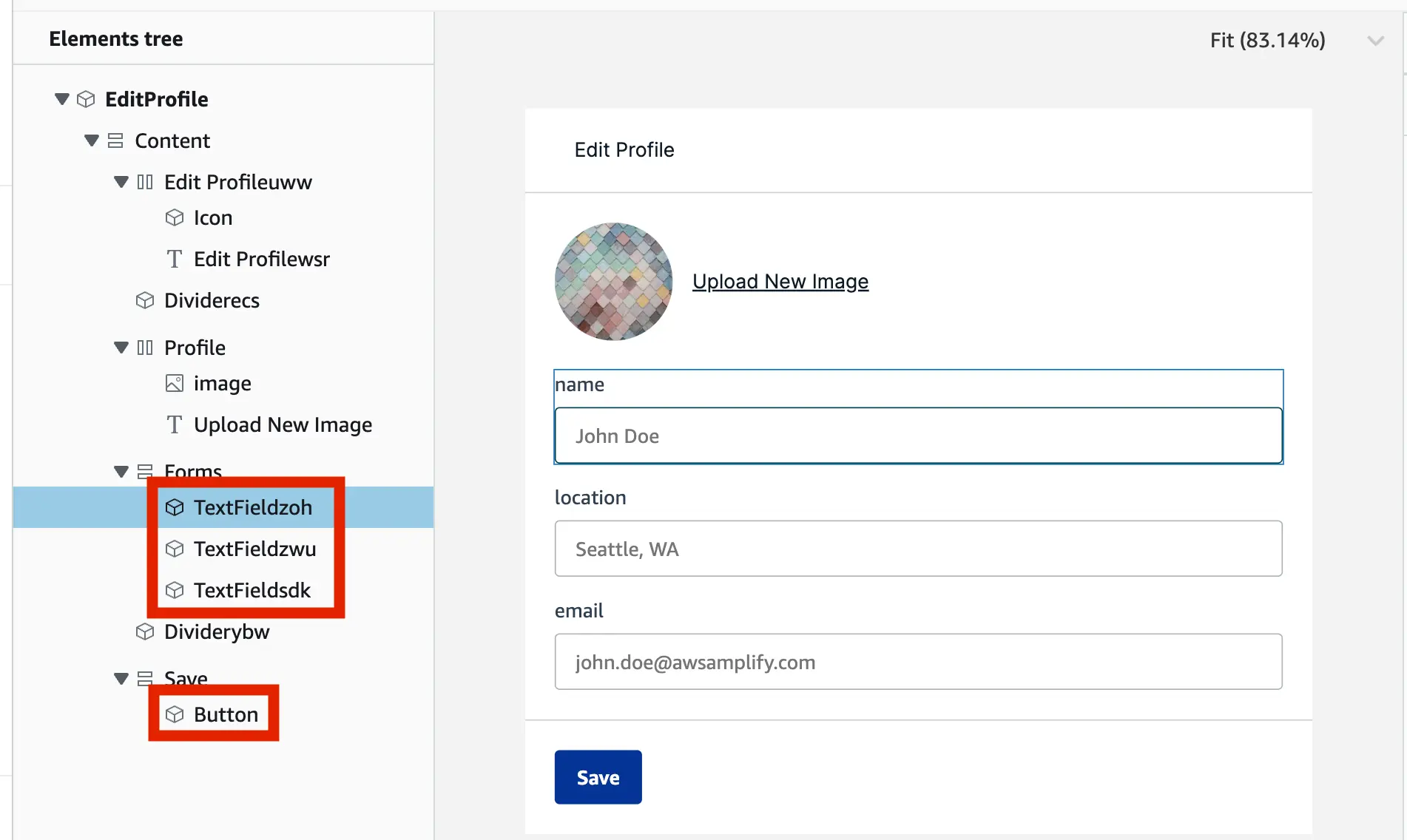
Save form data
Amplify Studio provides data action bindings but if you can also self-manage the form submission states and workflows in code.
Get the override keys based on the element name in Studio and then set onChange handlers. For example TextFieldzoh is the name of the "name input field" component.
1const [name, setName] = useState("");2const [location, setLocation] = useState("");3const [email, setEmail] = useState("");4
5const profileOverrides = {6  "TextFieldzoh": {7    onChange: (event) => { setName(event.target.value) }8  },9  "TextFieldzwu": {10    onChange: (event) => { setLocation(event.target.value) }11  },12  "TextFieldsdk": {13    onChange: (event) => { setEmail(event.target.value) }14  },15  "Button": {16    onClick: () => alert(`Saving form ${name} ${location} ${email}`)17  }18}19
20return (21    ...22    <EditProfile overrides={profileOverrides}/>23    ...24)
Navigation from parent to detail views
Amplify Studio provides navigation action bindings but if you want to integrate with your own routing system, you can also self-manage the navigation actions.
For example, you want to click on an item in a collection to get to detail views. Use the overrideItems prop to modify each element's property within a collection. The return value of overrideItems will be applied as an override onto the collection item's component.
1<HomeCollection2 overrideItems={({ item, index }) => ({3 style: {4 cursor: 'pointer'5 },6 onClick: () => {7 // The actual redirect can happen whichever way you want8 // `item` represent the data item that is passed into the9 // collection item. In this case, it's a "home".10 }11 })}12/>