Write React code
The generated UI components accept properties available on the "Flex" component or properties available on the "Collection" component.
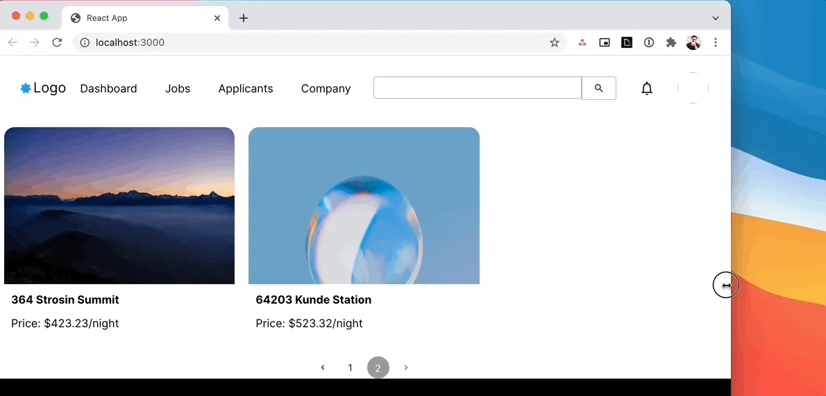
For example, to make a component go full width you can use all the properties available on an Amplify UI “Flex” component. In this case, I've set width={“100vw”} for the NavBar and the MarketingFooter, so it scales with my browser window size. You can also enable pagination for NewHomes by setting the isPaginated and itemsPerPage properties.
1import './App.css';2import { NewHomes, NavBar, MarketingFooter } from './ui-components'3
4function App() {5  return (6    <div className="App">7      <NavBar width={"100vw"}/>8      <NewHomes isPaginated itemsPerPage={3}/>9      <MarketingFooter width={"100vw"}/>10    </div>11  );12}13
14export default App;
Now, you can change the window size and also paginate through the collection as well.
There are many more customizations you can apply in code such as applying overrides to child elements, setting up onClick handlers for collection items, or set hover states on icons. Review Extend via Code in the Amplify Studio documentation.